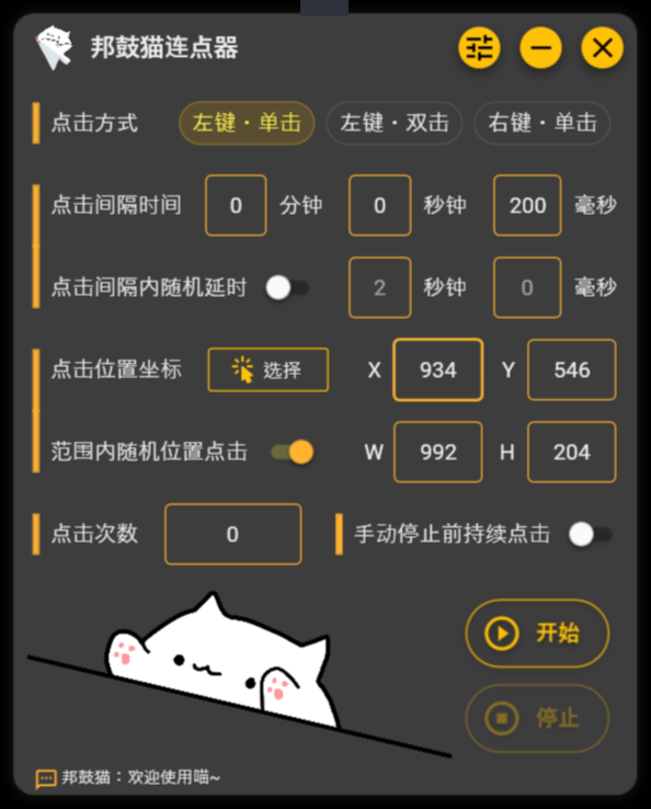
Bongo Paw Clicker Development Summary
This article is a development record of Bongo Paw Clicker, documenting the issues I encountered during the development of the auto clicker.

Links
UI Design
WPF employs the Extensible Application Markup Language (XAML) to generate UI elements. The XAML Designer in Visual Studio offers a visual interface to assist in UI design. Using XAML is somewhat akin to working with CSS, and it’s relatively easy to get started. The real challenge lies in the design aspect. On a personal note: I find that as a programmer, handling UI design can be truly exhausting – I often spend more time designing the UI than actually writing the code.
Window Layout
In my UI design, I utilized the Grid and StackPanel elements for layout purposes. The Grid is used to create horizontal functional areas, while the StackPanel is employed to arrange components horizontally within each row of the Grid. For more layout options, you can refer to the Microsoft documentation.
When placing multiple components directly within the same Grid, these components stack on top of each other instead of arranging in order. To achieve uniform spacing, one needs to assign Margins to each component individually, which can be quite cumbersome. That’s why I decided to nest a StackPanel within the Grid for component arrangement.
Grid
As the name implies, the Grid divides the panel into different grids.
Grid Example
1 | <Grid> |
StackPanel
StackPanel can arrange components horizontally or vertically in a single row. It does not automatically wrap content to the next line; any content exceeding the width will be hidden.
StackPanel Example
1 | <StackPanel |
Material Design
Initially, I thought about crafting my own UI styles, but as I delved deeper, I realized how naive I was. Dealing with things like rounded corner radii and button animations was quite overwhelming. So, I decided to take a different approach and use a UI framework directly in my program. The advantages of this approach are that it’s time-saving and visually appealing, but the downside is that the file size of the program after packaging might increase. After pondering for a while, I ultimately settled on Material Design In XAML.
Usage
In App.xaml, I added a new namespace reference: xmlns:materialDesign="http://materialdesigninxaml.net/winfx/xaml/themes", and then I added a few ResourceDictionary entries.
App.xaml
1 | <Application |
Then, in each XAML file corresponding to a window, I added namespace references and related attributes (optional) within the Window tag.
Window Tag
1 | <Window |
Window Style
Because I wanted to achieve a borderless window (I’m both inexperienced and adventurous🐶), I set the WindowStyle attribute to None within the Window tag. The advantage of doing this is the freedom it offers in designing the window style according to your preferences. However, the drawback is that this approach is overly flexible – functionalities like close, minimize, and others need to be implemented from scratch, and the native Windows animation effects are lost.
Function Buttons
First, in the MainWindow.xaml file, I redesigned the top bar. On the left is the application title, and on the right are the function buttons: Settings, Minimize, and Close. Then, I bound the Click events to the buttons.
Close Button Example
1 | <!--MainWindow.xaml Example of Close Button--> |
Finally, in MainWindow.xaml.cs, I re-implemented the button functionalities:
- Close the window:
Close() - Minimize:
this.WindowState = WindowState.Minimized - Drag the window:
DragMove()
Close Window Example
1 | //MainWindow.xaml.cs Example of Close Window |
Window Shadow
To achieve the shadow effect, it’s necessary to allow window transparency and set the window background to a null value.
MainWindow.xaml Relevant Tags Example
1 | <Window |
Below are two incorrect examples. In the left image, window transparency wasn’t allowed, resulting in a black border around the window. In the right image, the background was set to red.
For the shadow effect, I used the DropShadowEffect within the Grid.
DropShadowEffect Example
1 | <Grid.Effect> |
At this point, the shadow won’t be visible because it surrounds the Grid from the outside, and the current Grid already occupies the entire window space. Consequently, the shadow remains invisible. To fix this, we need to set an outer margin for the Grid using the Margin property. The specific margin value should be based on the width of the shadow.
Window Rounded Corners
There are multiple ways to achieve rounded corner effects. We can use UniformCornerRadius="radius" within a Card to uniformly set the radii for all four corners, or we can use CornerRadius="topLeft, topRight, bottomRight, bottomLeft" within a Border to set radii for each corner separately. I opted for the Card approach and set the corner radius to 15.
Window Rounded Corners Example
1 | <materialDesign:Card Background="{DynamicResource CardBackgroundColor}" UniformCornerRadius="15"/> |
Window Animation
There are four animations that need to be re-implemented: window startup, window close, minimize, and restore from minimize.
- Window startup: Mimicking the native Windows animation.
- Window close: Mimicking the native Windows animation.
- Minimize: The window slides downward while gradually decreasing opacity.
- Restore from minimize: The window slides upward from the bottom while gradually increasing opacity.
Create Animations
The native Windows startup animation involves the gradual increase of window opacity and the gradual expansion of the window from 0.7-0.8 times its size outward to its normal size. The window close animation is the reverse of this. I’ll illustrate how to create the animation for window startup. To achieve a similar effect, we need to create a Storyboard and add three DoubleAnimation instances to it for opacity change, horizontal stretch, and vertical stretch.
Opacity
Opacity animation is straightforward. The following code demonstrates how to animate the opacity from 0 to 1 when the window starts. Pay attention to the FillBehavior property; its default value is HoldEnd, meaning that the value of To in the animation will overwrite the program’s original value. This can cause issues in certain cases, so the solution is to set it to Stop.
Opacity Animation
1 | <DoubleAnimation |
Window Stretch
First, set the x:Name and RenderTransformOrigin properties within the main Grid. x:Name is used for the stretch animation to find the corresponding Grid, while RenderTransformOrigin sets the starting point of the animation. Its values range from 0 to 1; when set to 0,0, the animation starts from the upper-left corner of the window, and when set to 1,1, it starts from the lower-right corner. Here, I set it to 0.5,0.5, which is the center of the window.
Next, add the RenderTransform property to the Grid. RenderTransform is a property used to apply transformations to an element during rendering. It allows us to apply transformations like translation, scaling, rotation, and skew to change an element’s position, size, and direction during rendering. To make it easier to add other effects later, I used the TransformGroup class, which is a container class in WPF used to combine multiple transformation effects. It allows us to combine translations, scaling, rotation, skew, and more, and apply them all simultaneously to an element.
The next step is to add the horizontal and vertical stretch animations, using DoubleAnimation, to the previously created Storyboard. Use Storyboard.TargetName to specify the object to be stretched and Storyboard.TargetProperty to specify the type of transformation.
Window Stretch Animation
1 | <Window.Resources> |
Trigger Animations
Triggering the window loading animation is quite simple; we just need to add a Window.Triggers section in the XAML file.
Window.Triggers Example
1 | <Window.Triggers> |
However, animations like minimizing the window are not quite suitable for direct use with Window.Triggers, as there are some special cases where we need to determine whether to play the animation. Therefore, I triggered these animations in the code. Below is the code used to trigger the animation for restoring the window from minimized state. We need to add the line StateChanged="Window_StateChanged" to the Window tag in the XAML file to bind the window state change event.
Window State Change Code
1 | private void Window_StateChanged(object sender, EventArgs e) |
Images and Audio
I created an “Asset” folder in the root directory to store media resources such as images and audio.
Application Icon
I designed a simple and straightforward icon – a Bongo Cat holding a mouse cursor. This was done using a few steps in Photoshop. To add the icon, open the project’s Properties, select Resources under the Application menu, then click the Browse button and locate your icon. Icon files must be in the ico format.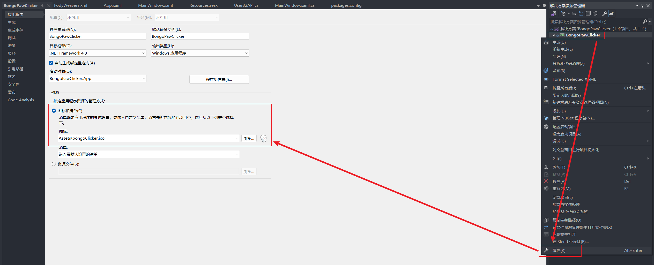
Bongo Cat
I achieved the effect of Bongo Cat tapping the table in sync with mouse clicks by switching between four images representing different states of Bongo Cat’s paws:
- Default state: Both paws are raised.
- Left mouse button click: The left paw is tapped down.
- Left mouse button double click: Both paws are simultaneously tapped down.
- Right mouse button click: The right paw is tapped down.


First, I prepared the four images in Photoshop, aligning the outlines of Bongo Cat’s body and exporting them to files of the same size. I then placed them all within the same canvas and set them to the same size and alignment. The Visibility property of the three images, except for the default state image, was set to "Collapsed".
Visibility Property
Visibility property controls the visibility of an element on the interface. In WPF, the Visibility property can have three possible values: Visible, Collapsed, and Hidden.
- Visible: The element is visible and occupies layout space. It is displayed on the interface and responds to user interaction.
- Collapsed: The element is invisible and doesn’t occupy layout space. It won’t appear on the interface and won’t take up any space. Unlike
Visible, when set toCollapsed, the element doesn’t leave any whitespace, and the surrounding layout becomes compact. - Hidden: The element is invisible but still occupies layout space. Similar to
Visible, the element won’t be visible, but it still occupies space, preventing the surrounding layout from compacting.
In general, if you want to completely hide an element and want the surrounding layout to rearrange to fill its place, you can use Collapsed. If you want the element to be hidden but still occupy space, you can use Hidden.
Next, I handled the interactions in the code. For instance, for a left mouse button single click, when simulating the click event, I set the left paw’s “Visible” property to true and collapsed the default state image. After a 100-millisecond delay, I restored the original state by collapsing the left paw and making the default state image visible again.
Left Mouse Click Example
1 | if (clickType == 0) // Left mouse button click |
When a user interrupts the execution of the click event, the image switching might be interrupted, and the currently displayed image might not be the default state image. Therefore, after the simulation click command is interrupted or ends, we need to restore the images to their default state.
Play Audio
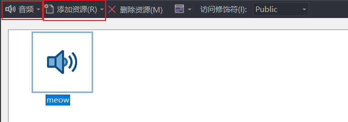
When adding audio, I encountered an interesting issue. If we use MediaPlayer directly in XAML, we need to use an absolute path to the audio file when calling it in the code. Using a relative path will result in a resource not found error. In the end, I added the audio file to Resources.resx and successfully called it using Properties.Resources.[FileName].
Audio Playback Code
1 | public partial class MainWindow : Window |
Here’s another tricky part: by default, Resources.resx shows the resource type as “String”. We need to switch it to “Audio” from the dropdown menu in the top-left corner. We also need to click a very small and subtle arrow to open the dropdown menu, as shown in the image below.
UI Thread and Dispatcher
You might have noticed the use of Dispatcher for switching cat paw images in the code. This relates to the issue of the UI thread.
UI Thread
The UI thread is responsible for handling user interface interactions and updates. In WPF applications, the UI thread is responsible for creating, displaying, interacting with, and updating user interface elements such as windows, buttons, text boxes, and more. The UI thread is responsible for rendering the interface, responding to user input, and handling various UI events.
The importance of the UI thread lies in its thread context. Most UI frameworks, including WPF, require all UI-related operations to be performed on the same thread to ensure thread safety. This means you can’t directly update UI elements on a non-UI thread, as it might lead to cross-thread issues.
Some characteristics of the UI thread include:
- Single-threaded model: In most UI frameworks, including WPF, the UI thread follows a single-threaded model. This means all UI element creation, modification, and interaction must be performed on the same UI thread.
- User interface operations: The UI thread is responsible for handling various user interface operations, including responding to user input, processing mouse and keyboard events, handling window state changes (maximize, minimize, etc.).
- Rendering and drawing: The UI thread is responsible for rendering and drawing user interface elements, ensuring they are correctly displayed on the screen.
- Responsiveness: To maintain the responsiveness of an application, the UI thread should remain lightweight to promptly respond to user actions.
- Thread safety: Operations on the UI thread must be thread-safe to avoid concurrency and synchronization issues.
When performing lengthy calculations or time-consuming operations, these tasks should be offloaded to non-UI threads to maintain UI smoothness. However, when updating UI elements, you still need to use the Dispatcher to dispatch operations to the UI thread to ensure thread safety.
Dispatcher
The Dispatcher is a mechanism in WPF that allows you to schedule operations on the UI thread from a non-UI thread. By using the Dispatcher, you ensure that UI element updates and operations occur on the correct thread, avoiding thread safety issues.
For instance, if you’re performing a calculation on a background thread and want to display the result on the UI, you need to use the Dispatcher to send the update operation to the UI thread. This ensures that UI element updates don’t lead to cross-thread problems.
The Dispatcher offers three commonly used methods: Invoke, BeginInvoke, and InvokeAsync.
Invokeis a synchronous method, which means the calling thread will be blocked until the operation is completed on the UI thread.- Both
BeginInvokeandInvokeAsyncare asynchronous methods. They enqueue the operation to the UI thread’s message queue and return immediately without blocking the calling thread, allowing it to continue executing subsequent code.InvokeAsyncwas introduced in.NET Framework 4.5. The main difference between the two is how they handle exceptions.InvokeAsyncis preferred, especially when you need to use theawaitmethod.
Settings Panel
I created a separate window for the settings panel within the program. The settings panel provides the following functionalities:
- Toggle between light and dark themes for the application.
- Set whether the application should always stay on top.
- Configure hotkeys.
- Define reminders after completing clicks.
Create the Window
To begin, I added a button in the XAML file of the main window and bound it to the Click event Click="SettingButton_Click". Then, I added a new window to the project and named it SettingPanel. Next, I opened the code file of the main window and edited the automatically generated method code.
Creating the Settings Window
1 | private void SettingButton_Click(object sender, RoutedEventArgs e) |
ShowDialog and Show
ShowDialog and Show
In WPF, Show and ShowDialog are two different ways to display windows.
Show
- Windows displayed using the Show method are non-modal, meaning they do not prevent interaction with other parts of the application.
- Users can freely switch between open windows, and even interact between the main window and other open windows.
- The Show method returns immediately, without waiting for the opened window to close.
ShowDialog
- Windows displayed using the ShowDialog method are modal, meaning they prevent interaction with other parts of the application until the window is closed.
- Users must close the modal window before returning to the main window or other open windows.
- The ShowDialog method returns after the opened window is closed, making it suitable for implementing dialogs that require user response.
Theme Switch
During late-night testing, I found the default light theme too harsh on the eyes. So, I decided to add a dark theme option with a button in the settings window for theme switching.
Material Design comes with built-in light and dark themes, as well as several sets of primary color schemes. The Primary Color further divides into Light, Normal, and Dark variants. Components like TextBox and ToggleButton use the Light variant, while Buttons use the Dark variant. I was dissatisfied with the Light variant’s color scheme, so I added a custom color scheme using resource dictionaries. I used my own color scheme for the window background, toggle buttons, etc., while using the default Material Design colors for regular buttons.
First, I added two SolidColorBrush properties in the App.xaml file. CardBackgroundColor represents the window’s background color, while IndicatorColor represents the theme color for various controls. By default, it is set to the light theme.
SolidColorBrush Example
1 | <Application.Resources> |
Then, in the SettingPanel.xaml, I added a toggle button with Checked and Unchecked events bound to methods for turning on and off the dark mode.
Toggle Button Example
1 | <ToggleButton |
Next, I edited the corresponding methods in SettingPanel.xaml.cs. Initially, I placed all the theme-switching code in the settings window. However, I noticed that clicking the toggle button only changed the settings window’s theme, and the main window only switched to the default Material Design dark theme. My custom colors scheme didn’t change. I realized I needed to force a refresh of Dynamic Resources in the main window to change the custom colors. So for the sake of convenience, I just moved the theme-switching code to the main window.
Code in Setting Window
1 | //SettingPanel.xaml.cs |
Code in Main Window
1 | //MainWindow.xaml.cs |
Finally, set the Background="{DynamicResource IndicatorColor}" or BorderBrush="{DynamicResource IndicatorColor}" attribute to the components that require the application of the custom colour scheme, instead of using Material Design’s Primary Color.
Simulate Mouse Clicks
Simulating mouse clicks involves using the user32.dll. user32.dll is a core DLL in the Windows operating system and contains many functions related to user interface, such as creating windows, displaying message boxes, handling input, etc. To call user32.dll in a .NET program, you need to use P/Invoke(Platform Invocation Services) with the [DllImport("user32.dll")] attribute, and the method signature includes the extern keyword to indicate it’s an external method.
I created a class named User32API.cs to store code related to user32.dll. Simulating a click involves two steps: first, using the SetCursorPos function to move the cursor to the specified screen coordinates, and second, using the mouse_event function to perform the actual click based on the specified click type.
SetCursorPos
The SetCursorPos function moves the mouse cursor to the specified screen coordinates. The function prototype is as follows:
1 | BOOL SetCursorPos(int X, int Y); |
Parameter explanation:
- X: The X-coordinate value in screen pixel units, representing the horizontal position.
- Y: The Y-coordinate value in screen pixel units, representing the vertical position.
After calling this function, the mouse cursor will be moved to the specified coordinates, regardless of whether the mouse is inside an active window. Additionally, this function doesn’t show the movement visually.
If the provided X or Y values are outside the screen boundaries, the system limits the mouse position to the visible area of the screen. For example, if you set X to a negative value, the system will set it to the left boundary, and if you set X to a value greater than the screen width, the system will set it to the right boundary. The same logic applies to the Y value.
SetCursorPos Example
1 | [] |
mouse_event
The mouse_event function simulates mouse operations such as clicks, movements, scrolling, etc. The function prototype is as follows:
1 | VOID mouse_event( |
Parameter explanation:
- dwFlags: Flags representing the type of mouse operation, indicating the action type (e.g., click, move, scroll, etc.).
Common Action Types
Type Value Description MOUSEEVENTF_ABSOLUTE 0x8000 Absolute coordinate flag MOUSEEVENTF_LEFTDOWN 0x0002 Left button down MOUSEEVENTF_LEFTUP 0x0004 Left button up MOUSEEVENTF_RIGHTDOWN 0x0008 Right button down MOUSEEVENTF_RIGHTUP 0x0010 Right button up
- There are two uses for
dxanddy- If you use the
MOUSEEVENTF_ABSOLUTEflag,dxanddyare interpreted as absolute screen coordinates. In this case, their values typically range from 0 to 65535. This is because the screen coordinate system usually has a range of 0 to 65535, where (0, 0) represents the top-left corner of the screen, and (65535, 65535) represents the bottom-right corner. If you want to simulate absolute mouse movement on the screen, you need to use absolute coordinate values.Example: Move the mouse to the center of the screen
1
2
3
4
5int screenWidth = 1920;
int screenHeight = 1080;
int centerX = (screenWidth * 65535) / 2;
int centerY = (screenHeight * 65535) / 2;
mouse_event(MOUSEEVENTF_MOVE | MOUSEEVENTF_ABSOLUTE, centerX, centerY, 0, 0);
- If you don’t use the
MOUSEEVENTF_ABSOLUTEflag,dxanddyare interpreted as relative movement in pixels. In this case, their values usually range from a signed 16-bit integer, where negative values indicate left or upward movement, and positive values indicate right or downward movement.
- If you use the
- dwData is used to indicate the scroll distance for mouse scrolling. A positive value means scrolling up, while a negative value means scrolling down. If the
dwFlagsdoes not include a mouse scroll event, set this to 0. - dwExtraInfo represents additional information, usually set to 0.
Simulating Clicks Example
1 | private const int MOUSEEVENT_LEFTDOWN = 0x0002; |
Capturing Mouse Coordinates
Directly asking users to input coordinates for clicking is not practical because there’s no pixel ruler on the screen to indicate cursor position. Therefore, we need to design a window that displays cursor coordinates in real-time and captures cursor pixel coordinates when the user presses the left mouse button. Additionally, since we’ve added support for random clicking within a specified area, this window should also allow capturing pixel coordinates through rectangle selection.
Create New Window
- Create a new window.
- Set the window state to maximise and always on top, and remove the default window style.
- Allow window transparency and set the opacity to 0.5 so that users can see the content behind the window.
- Bind the
KeyDownevent to close the window when the user presses theEsckey. - Bind the
MouseMoveevent to update cursor pixel coordinates in real-time. - Bind the
MouseLeftButtonDownandMouseLeftButtonUpevents for point and rectangle selection. - Add two
Labelelements to display pixel coordinates as the cursor moves. - Add a
Rectangleelement for previewing the selected rectangle.
Window Tag Example for Capturing Mouse Coordinates
1 | <Window |
Get Cursor Coordinates
We can use e.GetPosition(this) to get the coordinates. GetPosition is a method in WPF used to get the local coordinates of the mouse or touch operation relative to a specified element. It returns a Point object, which is a structure representing a 2D coordinate point. It has two properties: X and Y, representing the horizontal and vertical coordinates, respectively. Both Point.X and Point.Y are of type double.
Note that the coordinates obtained here are local coordinates of the window, not absolute screen pixel coordinates. We need to convert them to screen coordinates using the PointToScreen method. The PointToScreen method takes a Point object representing the coordinate relative to the calling element. It returns a Point object representing the absolute position on the screen.
Rectangle Preview and Capture
The preview rectangle needs to update in real-time as the cursor moves. We need to adjust the rectangle’s width and height each time the MouseMove event is triggered. Since the preview box is drawn inside the window, the window local coordinates are used directly here. Additionally, we need to consider the possibility of reverse selection, where the user drags the selection from the bottom-right corner to the top-left corner. Therefore, the length and width of the rectangle needs to be taken as the absolute value of the difference between the coordinates of the two points.
If the user has enabled clicking within a random range, the program needs to capture two screen coordinates: the starting and ending points of the selection rectangle, i.e., the points where the left mouse button was pressed and released. I used variables w and h to represent the width and height of the rectangle, and their values are the absolute differences between the horizontal and vertical coordinates of the two points.
Code for Rectangle Preview and Capture
1 | //Screen Pixel Coordinates |
Store User Configuration
To store user-customized configurations, we need to set the program automatically load and restore these configurations when the program starts, and save them when the program closes, follow these steps:
- Open
./Properties/Settings.settings. - Add the properties you want to save, set their initial values and types.
- In the main window’s XAML, bind the
Loadedevent to theWindow_Loadedevent handler. - In the code, use
Properties.Settings.Default.[PropertyName]to read the corresponding properties. - Before the window is closed, use
Properties.Settings.Default.Save();to save the properties.
Hotkey Configuration
If the user sets a relatively small interval for clicks, they won’t be able to prematurely end the simulated clicks by clicking the stop button. This is because the program will keep moving the cursor to the predefined points. Therefore, it is necessary to implement the functionality of stopping the clicks using hotkeys. Additionally, since the hotkeys of this program might conflict with the hotkeys of other software the user is using, it’s important to provide the ability for users to customize the hotkeys.
Configuring Hotkeys
UI
I have added a text box in the settings window to record the key pressed by the user, followed by an “OK” button to trigger subsequent actions.
The text box needs to be set as read-only and bound to the PreviewKeyDown event. Unlike the regular KeyDown event, the PreviewKeyDown event is a tunneling event that travels down the visual tree from the parent element and then bubbles back up from the target element. The purpose of this event is to allow preprocessing or interception of keyboard events after a key is pressed but before it is released.
Text Box Example
1 | <TextBox |
Preprocess Keyboard Events
When the PreviewKeyDown event is triggered, the program will determine whether the key pressed by the user is valid, as there are some special keys that cannot be used as hotkeys and need to be excluded. After processing, the pressed key will be returned as a string and displayed in the text box.
The keys pressed by the user can be classified into two categories: Key and ModifierKeys. These are both enumerations used for handling keyboard input.
Key: TheKeyenumeration defines all possible keyboard keys, including letters, numbers, function keys, control keys, and more. This enumeration allows determining which key the user has pressed. Here are some examples of theKeyenumeration:Key.A: Represents the letter A keyKey.Escape: Represents the Esc keyKey.Enter: Represents the Enter keyKey.Space: Represents the space key- For a complete list of enumerations, refer to the Microsoft official documentation
ModifierKeys: TheModifierKeysenumeration defines a set of modifier keys that are typically used in combination with other keys to perform specific actions. These modifier keys include Shift, Ctrl, Alt, and the Windows key. Here are some examples of theModifierKeysenumeration:ModifierKeys.None: No modifier keys are pressedModifierKeys.Shift: The Shift key is pressedModifierKeys.Control: The Ctrl key is pressedModifierKeys.Alt: The Alt key is pressed
Because some keys in the Key enumeration are the same as the modifier keys in the ModifierKeys enumeration, these keys need to be excluded.
Keyboard Event Preprocessing Code
1 | private Key hotKey; |
Register/Unregister Global Hotkeys
The registration and unregistration of global hotkeys also involve the use of user32.dll. The function used for registration is RegisterHotKey, and for unregistration, it’s UnregisterHotKey. It is recommended to register global hotkeys when the program starts and unregister them upon exit to avoid conflicts with hotkeys from other programs.
RegisterHotKey Function
Purpose: Registers a global hotkey in the operating system that can be defined by the user and can trigger even when the application is running in the background or without focus.
1 | [] |
Parameters:
hWnd: The handle of the window that will receive the hotkey notification, typically the handle of the main window.id: Identifier for the hotkey, used to distinguish different hotkeys.fsModifiers: Hotkey modifiers such as Ctrl, Alt, Shift, etc.vk: Virtual key code to be used with the hotkey, can be obtained through conversion from theKeyenumeration.
By default, the function returns a non-zero value if the hotkey is successfully registered and zero on failure. However, for ease of further processing, the MarshalAs attribute is used here to convert the return value into a boolean type.
UnregisterHotKey Function
Purpose: Unregisters a previously registered global hotkey.
1 | [] |
Parameters:
hWnd: The window handle provided during the previous hotkey registration.id: The hotkey identifier provided during the previous registration.
Binding Hotkey Functionality
Create a new method called Regist in User32API.cs to bind the hotkey functionality. When the program starts, the main window reads Key and ModifierKeys from user configuration, and then passes them along with a callback function to bind the hotkey command.
Main Window Code
1 | // Override the window initialization method |
In addition, I have defined a delegate type HotKeyCallBackHanlder here. It’s a pointer to a function and is used to define the action to be taken when a global hotkey is triggered.
A delegate is a reference type variable that holds a reference to a method with a particular signature. It allows us to define the signature of a method and then use it as a parameter for methods or assign it to other method variables for dynamic method invocation at runtime.
Hotkey Registration Code and Explanation
1 | public delegate void HotKeyCallBackHanlder(); |
Handle Hotkey Messages
In Windows, WndProc is a function used to handle window messages. When a registered hotkey is triggered, the system sends a window message to the specified window handle, and we can process this message in the WndProc function.
Handling Window Messages in WndProc
1 | static IntPtr WndProc(IntPtr hwnd, int msg, IntPtr wParam, IntPtr lParam, ref bool handled) |
Change Hotkeys
Create a new method called ModifyGlobalHotKey in User32API.cs. When the user enters a new hotkey in the settings window and clicks the “OK” button, the program will update the variable storing the hotkey value and pass the updated hotkey value to User32API.cs.
ModifyGlobalHotKey will first unregister the previous hotkey and then attempt to register the new hotkey. If the registration fails, an error message box will be displayed.
Modifying Hotkeys with ModifyGlobalHotKey
1 | public static void ModifyGlobalHotKey(WindowInteropHelper windowInteropHelper, Key key, ModifierKeys modifiers) |
Read-in and Save Hotkeys
Since both the Key and ModifierKeys that make up a hotkey are enumeration types, and ./Properties/Settings.settings does not support storing enumeration types, we need to use ToString() to convert them into string types before saving.
Save Hotkeys Code
1 | private Key hotKey; |
During program startup, use Enum.Parse() to convert the stored strings back into enumeration types. Make sure to place this code in the window’s initialization code; if placed in the window’s load code, this segment might not get executed, which is confusing.
Read-in Hotkeys Code
1 | private Key hotKey; |
Localization
There are multiple methods for localizing WPF applications, such as using resource dictionaries, NuGet packages, and .resx resource files. I’m using the relatively convenient .resx resource files.
Create Resource Files
- Open
./Properties/Resources.resxin the Visual Studio Solution Explorer. The structure here is similar to aDictionary<string, string>, where the name serves as theKeyand the value is theValue. - Fill in default language resource key-value pairs.
- Change the
Access ModifierfromInternaltoPublic. - Add a new resource file and name it as
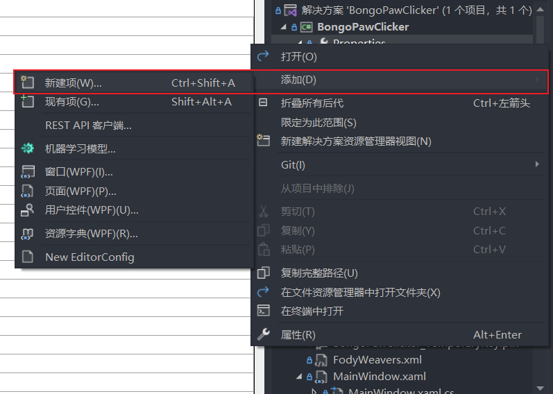
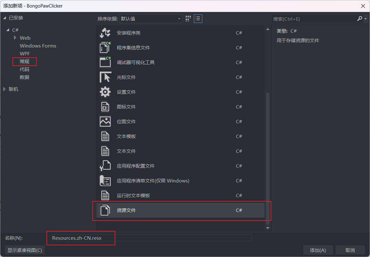
Resources.[LCID].resx, where[LCID]is the Windows Language Code Identifier. For example, the resource file for Simplified Chinese should be namedResources.zh-CN.resx. For a complete list of language codes, refer to MS-LCID.![bpc_resx1.png]()
![bpc_resx2.png]()
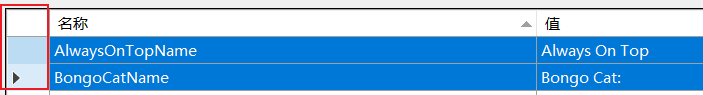
- Copy the contents from
Resources.resxto the newly created resource file and modify the values according to the language.![bpc_resx3.png]()
Usage
XAML
In your XAML files, add a new namespace reference, replacing PackageName with your project name:
1 | xmlns:lang="clr-namespace:[PackageName].Properties" |
Use x:Static to reference resources in your text content. In the following example, KeyName is the key value from the language resource file:
1 | Text="{x:Static lang:Resources.KeyName}" |
Code
In your code, you can directly reference resources:
1 | var example = Properties.Resources.KeyName; |
Runtime
The functionality I implemented is that the program automatically switches to the corresponding language based on the system’s language identifier when it starts. Currently, only Simplified Chinese and English are supported. You can use CultureInfo.CurrentUICulture.Name to get the system’s language identifier. To achieve this, you need to modify App.xaml.cs. Here’s the complete code:
1 | protected override void OnStartup(StartupEventArgs e) |
Packaging the Program
The solution folder generated by Visual Studio contains many files, including resource files such as images and audio, as well as the necessary DLL runtime libraries. These files are essential for the program to run and are often referred to as dependencies. If you try to copy only the executable file (exe) to another directory, it won’t run because it lacks these dependencies. This poses the problem that users need to download the entire folder containing dependencies to use the software, which is inconvenient. Therefore, the challenge here is to package all the required files into a single executable (exe) so that users can use it directly. The solution involves installing two NuGet packages: Costura.Fody and Resource.Embedder.
Costura.Fody
Costura.Fody is an open-source add-in for Fody. Its main function is to embed dependencies from assemblies into the main assembly, reducing the need for external dependencies during deployment and distribution. It achieves this by modifying the Intermediate Language (IL) code during compilation, so you don’t have to worry about missing external dependencies at runtime.
Installation and Usage
Search for Costura.Fody in the NuGet Manager in Visual Studio and install it. Since it’s an add-in for Fody, installing it will also install Fody itself along with many dependencies, around 40 of them.
After installation, create a new file named FodyWeavers.xml and add it to the root directory of your solution explorer. Then, paste the following content into the file and save it:
1 |
|
Now, rebuild the solution in Visual Studio. You’ll notice that the size of the generated executable (exe) file has increased significantly. When you copy this executable to another directory, it can be used normally without needing to copy additional files.
New Issue
While adding localization support to the program, I encountered a new problem. The newly created .resx language files were not being correctly added to the executable (exe) by Costura.Fody, resulting in the program always displaying in English during runtime. If I was debugging within Visual Studio, the program could display in the newly added language, but when I copied the exe file separately, it reverted to the default language.
At this point, the file structure in the ./bin/Debug directory looked like this:
1 | ./Debug |
Based on my research, I deduced that this issue might be related to the fact that the localized resources are part of Satellite Assemblies. Resources from satellite assemblies are available in specific cultures, and these resources are loaded only when the user selects the corresponding culture settings. However, during the execution of Costura.Fody, the new language files weren’t selected and loaded. Consequently, only the default language files were embedded, and the new language files were loaded into the solution directory after the packaging was completed.
The related issue has already been discussed on GitHub: Costura doesn’t embed resource satellite assemblies, and a solution has been provided: Install Resource.Embedder and use it in conjunction with Costura.Fody.
Satellite Assemblies
Satellite Assemblies
In WPF, primary assemblies and satellite assemblies are two different concepts of assemblies that have some differences in how they organize, deploy, and access resources in an application.
Primary Assembly
The primary assembly is the core assembly of an application. It usually contains the application’s startup code, main logic, and main window. The primary assembly can include various resources such as XAML files, images, styles, templates, etc. These resources can be accessed and used throughout the application’s lifecycle. The primary assembly typically has the following characteristics:
- Entry Point: The primary assembly contains the entry point of the application, which is the code executed when the application starts.
- Global Resources: Resources in the primary assembly can be accessed throughout the application without specific references.
- In-Memory: Resources in the primary assembly remain in memory during the application’s runtime, unless explicitly released.
Satellite Assembly
Satellite assemblies are auxiliary assemblies used for localization and resource management. They contain translated or localized versions of an application’s localized text, images, and other resources. Satellite assemblies enable the application to choose the correct resources based on the user’s language and region. Satellite assemblies generally have the following characteristics:
- Localized Resources: Satellite assemblies include localized or different language versions of resources to accommodate various languages and regions.
- Lazy Loading: Satellite assemblies are loaded into memory only when needed to reduce memory consumption.
- Naming Convention: Satellite assemblies are usually named based on the language and region, such as AssemblyName.resources.dll.
- Region-Specific: Resources in satellite assemblies are available in specific regions, and these resources are loaded only when the user selects the corresponding regional settings.
Summary
The primary assembly contains the main logic and resources of the application, while satellite assemblies are used for localization and resource management. The primary assembly includes the core code and global resources, while satellite assemblies contain localized resources specific to languages and regions. By separating resources into primary and satellite assemblies, WPF applications can achieve multilingual support, resource management, and better memory utilization.
Important Note
After rebuilding the solution using Costura.Fody, you might encounter errors in the Visual Studio XAML file preview. This is because Costura.Fody embeds all resources into the exe file, causing the Visual Studio design environment to be unable to find resources based on their original relative paths, resulting in preview errors. To resolve this, you can temporarily comment out the <Costura /> tag in the FodyWeavers.xml file when designing and previewing.
Resource.Embedder
Resource.Embedder is a tool for embedding resource files into .NET assemblies. Its working principle involves creating a virtual file system, embedding resource files into it, and then having Costura.Fody embed this virtual file system into the main assembly, achieving the embedding of satellite assemblies.
The installation process is similar to the previous package. Search for it in the NuGet Manager in Visual Studio and install it. After installation, there is no need to perform any additional configurations. Rebuild the solution in Visual Studio, and now the exe file should display in the new language and be runnable as a standalone application.
.NET Framework
The .NET Framework is a development framework developed by Microsoft for building and running applications on the Windows operating system. The program targets the .NET Framework 4.8 as its framework version.
Starting from the Windows 10 May 2019 Update (version 1903), .NET Framework 4.8 began to be pre-installed on Windows systems. Therefore, if you are running this program on an earlier version of Windows, you need to install .NET Framework 4.8 separately.
Relationship Between .NET Framework Versions and Windows Versions
- .NET Framework 1.0 and 1.1: Released in compatibility with Windows XP.
- .NET Framework 2.0: Compatible with Windows XP, Windows Server 2003, and Windows Vista.
- .NET Framework 3.0 and 3.5: Built into Windows Vista and Windows Server 2008, and can also be installed on Windows XP and Windows Server 2003 through updates.
- .NET Framework 4.0: Compatible with Windows XP, Windows Server 2003, Windows Vista, Windows 7, Windows Server 2008, and Windows Server 2008 R2.
- .NET Framework 4.5 to 4.8: Compatible with Windows 7, Windows 8, Windows 8.1, Windows 10, and corresponding Windows Server versions.
.NET Core vs. .NET Framework
.NET Core and .NET Framework are both cross-platform development frameworks developed by Microsoft. Here’s a brief comparison between .NET Core and .NET Framework:
- Cross-Platform Support
- .NET Core: Designed to be cross-platform, it can run on Windows, Linux, and macOS.
- .NET Framework: Primarily targeted at the Windows platform and cannot run directly on other operating systems.
- Open Source Nature
- .NET Core: Completely open source, with its source code hosted on GitHub.
- .NET Framework: While there are some open-source components and tools, the framework as a whole is not fully open source.
- Dependency and Deployment
- .NET Core: Manages dependencies using NuGet, and applications can be self-contained in terms of required runtime libraries.
- .NET Framework: Applications rely on the Global Assembly Cache (GAC), and developers need to ensure the required .NET Framework version is present on the target machine.
- Versioning and Updates
- .NET Core: Has shorter release cycles with frequent updates, introducing new features and improvements with each update.
- .NET Framework: Has longer release cycles with relatively slower updates, typically in the form of service packs or larger releases.
- API Support
- .NET Core: Offers a more modern and streamlined set of APIs, some Windows-specific features might not be supported in .NET Core.
- .NET Framework: Provides rich support for Windows APIs, enabling access to a wide range of Windows features.
- WPF and WinForms
- .NET Core: Currently lacks native support for WPF and WinForms application development, but support can be achieved through certain tools and libraries.
- .NET Framework: Offers full support for WPF and WinForms.
- Performance
- .NET Core: Generally offers better performance compared to .NET Framework due to its lightweight design and cross-platform nature.
- .NET Framework: Optimized for the Windows platform but might be relatively weaker in terms of cross-platform and performance aspects.
Venting: Why is writing documentation more exhausting than designing the UI…