Blog Upgrade Log for Next Theme Version 8.10
In May 2022, I upgraded my blog theme, Next, to version 8.10. Over the course of the past year, there have been several minor changes. So, I decided to use this blog post as my own update log. Currently, my Next theme is updated to version 8.18.2.
This post was translated from my Chinese blog post with the aid of ChatGpt.
Upgrade Log
The official website of the Next theme has been revamped again, and the top results on Google are all for old versions, which made it quite a task for me to find the right one.
Version 8.0 has integrated a lot of new features, making configuration easier compared to the older versions. Since I had messed up the source files of my website a while back, I had to manually configure it again this time (😭). However, the documentation is comprehensive, and following it closely gets the job done. The updates this time include:
- Changed the format of custom files from
swigtonjk, with no significant syntax changes. - Switched code block themes to
github-darkandgithub-dark-dimmed. - Replaced the image viewing tool from
mediumzoomtofancybox. - Enabled
panguto automatically add spaces between Chinese characters and words. - Enabled
quicklinkfor preloading, improving loading speed. - Replaced fonts with
思源宋体andFira Code. - Moved all images to the image hosting service sm.ms.
- Indexed by Bing search.
- New mascot.
- Custom mouse cursor style.
- Gradient background on mobile.
- Custom scrollbar.
- Custom code block style.
- Added GitHub contribution wall on the About page.
- Footer sticks to the bottom even if the content doesn’t fill the screen.
- Separate pagination control for tag directory in archives.
- End-of-article reminder.
- Encrypt/hide articles.
Some JS and CSS files distributed via JSDelivr.- Brand new 404 page.
- Custom blog post template
- New crash cheat function without using jQuery
JSDelivr
Well, JSDelivr has been blocked by the GFW (Great Firewall). You can skip this section; the GFW is up to no good.
I had to move the files I previously uploaded to JSDelivr back to the ./source/ directory of my blog.
For this upgrade, I had some custom JavaScript and CSS files hosted on JSDelivr for acceleration. JSDelivr is a CDN service provider that offers mirror acceleration for services like GitHub and npm. Some of the Next theme’s own files are also accelerated using JSDelivr.
How to Use
GitHub Configuration
- Create a repository on GitHub, and then clone it to your local machine.
- Add the files you want to use to the repository, and then push them to GitHub.
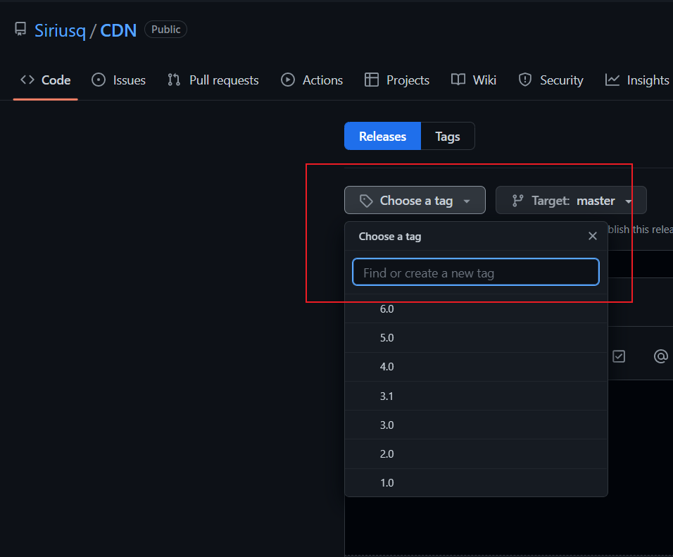
- Return to your repository, and add a “release.”
- Customize a version number as a “tag,” as shown in the image below.
- “Publish release.”
JSDelivr
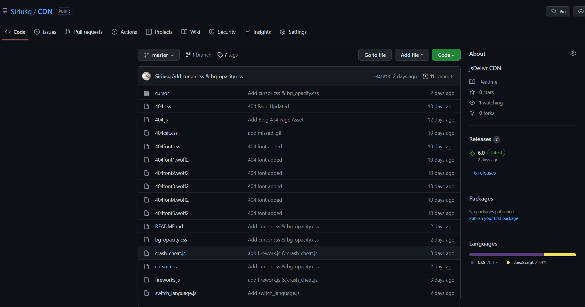
The referencing rule is https://cdn.jsdelivr.net/gh/GitHubUsername/GitHubRepository@ReleaseTag/FilePath. For example, the reference path for my file cursor.css below is https://cdn.jsdelivr.net/gh/Siriusq/CDN@6.0/cursor.min.css, where:
Siriusqis my usernameCDNis my repository name6.0is my tag; you can also uselatestinstead to represent the latest versioncursor.min.cssis my file path, where.minindicates requesting JSDelivr to compress it. You can remove it if you don’t want compression.
Then, paste the link into the corresponding location.
Font Replacement
The default font appeared a bit blurry on high-resolution screens, so I switched to 思源宋体 (Noto Serif SC), which many blogs are using. I also changed the code font to Fira Code and 思源宋体 (Noto Serif SC). Next now supports font selection by priority. If the characters needed are not found in the first font in the list, it will use the next one. If none of the specified fonts have the required characters, it will fall back to the default font, which is Microsoft YaHei on Windows. You can find more fonts on Google Fonts.
To make these font changes, open the configuration file of the Next theme, _config.next.yml, and navigate to # Font Settings. Modify the following options, where Noto Serif SC corresponds to 思源宋体:
1 | font: |
Image Hosting
I chose sm.ms as my image hosting service. The free version provides 5GB of storage capacity, and its access speed and stability within China are quite good, sufficient for my blog’s needs. The maximum number of images you can upload at once is 10, and it supports common formats such as jpg, png, gif, etc. After uploading, it automatically generates image links for use in Markdown.
Bing Search Indexing
First, go to Bing Webmasters, log in, and add your website.

If your website is already indexed on Google, you can choose to import it directly from Google Search Console, but this requires authorization. I was feeling lazy, so I opted for manual addition (haha). There are three ways to manually add your website. I chose the second one, which is to add HTML Meta tags to your web pages. This method is also built into the Next theme by default.

Copy the content after “content,” then open the configuration file of the Next theme, find bing_site_verification, paste it at the end, and save. After that, run hexo cl && hexo g -d. Finally, return to Bing Webmasters and click “Verify” to complete the process.
Custom Mouse Cursor Style
I configured the mouse cursor style according to the article by akilar. Special thanks to them.
- Create a new folder named
cursorin./node_modules/hexo-theme-next/source/css/. - Place the collected mouse cursor style files into the newly created folder.
- Open
_config.next.yml. - Locate
custom_file_path:. - Uncomment
style: source/_data/styles.styl. - Open
./source/_data/styles.styland paste the following code, modifying it as needed:
1 | /* Mouse Cursor Styles */ |
Currently, only .cur format files are supported. If you have downloaded files in the .ani format, you can use CursorWorkshop to convert them. There is a free trial version available for use.
Mobile Gradient Background
I referenced 卡尔霍恩的小屋 for the background section. Special thanks to them.
Because the Safari browser doesn’t support the simultaneous use of background-attachment: fixed and background-size: cover, the background image set using the original method would be vertically stretched to match the entire webpage’s height. Additionally, considering that mobile devices tend to have slower loading speeds, background images have a significant impact on loading times. Therefore, I decided to replace the image with a CSS gradient background.
Similar to the custom mouse cursor style, the background is configured in ./source/_data/styles.styl with the following code:
1 | body { |
The upper section represents the original configuration for desktop, and the lower section is for mobile, using the @media rule.
@mediarules are used for applying different styles for different media types/devices in media queries. Media queries can be used to check many things, such as:
- Viewport width and height
- Device width and height
- Orientation (is the device in landscape or portrait mode?)
- Resolution
Quoted from “CSS @media Rule,” W3Schools. [Online]. Available: https://www.w3schools.com/cssref/pr_mediaquery.asp. [Accessed: May 21, 2022].
In the code, max-width: indicates that when the browser window is smaller than 990px, the background is adjusted to a linear gradient style using linear-gradient. to bottom specifies a top-to-bottom gradient direction, and the % after the color indicates the color’s stop position. If there are only two colors, you can omit this part. For detailed gradient configurations, please refer to Using CSS Gradients. Additionally, you can find gradient styles on websites like uiGradients and oulu.
Custom Scrollbar
I configured the scrollbar according to the article by 星空下的YZY. Special thanks to them.
Similarly, open ./source/_data/styles.styl, and use the following code for the scrollbar:
1 | /* Scrollbar */ |
You can use the following pseudo-element selectors to modify the scrollbar styles for webkit-based browsers:
::-webkit-scrollbar— The entire scrollbar::-webkit-scrollbar-button— The buttons on the scrollbar (up and down arrows)::-webkit-scrollbar-thumb— The scrolling thumb on the scrollbar::-webkit-scrollbar-track— The scrollbar track::-webkit-scrollbar-track-piece— The part of the scrollbar track without the thumb::-webkit-scrollbar-corner— The intersection of the vertical and horizontal scrollbars when both are present, typically in the bottom-right corner of the browser window::-webkit-resizer— A draggable resize handle that appears in the bottom corner of some elements.Quoted from “-webkit-scrollbar,” Mozilla.org. [Online]. Available: https://developer.mozilla.org/en-US/docs/Web/CSS/::-webkit-scrollbar. [Accessed: May 21, 2022].
Custom Code Block Styles
Similarly, open ./source/_data/styles.styl, and use the following code:
1 | code { |
The code section controls the style for single-line code blocks, while figure.highlight controls the style for multi-line code blocks. For multi-line code blocks, adjustments have been made to the background color of line numbers and captions (changed to match the code background), caption text color, and position (moved to the top).
GitHub Contribution Chart
The GitHub contribution chart uses Github Chart API. Special thanks to them.
The usage is straightforward. Insert the following code:
1 | <img src="https://ghchart.rshah.org/yourGitHubUsername" alt="Github chart" /> |
If you want to customize the color of the blocks, replace 6c5ce7 with the HEX base color you want to use (other colors will be generated automatically, no need to add #):
1 | <img src="https://ghchart.rshah.org/6c5ce7/yourGitHubUsername" alt="Github chart" /> |
FancyBox Hide Caption
FancyBox’s caption doesn’t look very appealing, so let’s get rid of it! (Actually, it’s hidden.)
Open ./source/_data/styles.styl, and use the following code:
1 | // Hide image caption |
Footer Sticking to the Bottom
Thanks to the reference from smilv.
In the case of tag and directory pages, when the content on the page is not enough to fill one screen, the footer may awkwardly appear in the middle of the page. The following styles will keep the footer at the bottom consistently.
Open ./source/_data/styles.styl and use the following code:
1 | // Footer sticking to the bottom |
Separate Pagination Control for Archive, Tags, and Categories
Open ./config.yml, find # Pagination, and add the following code below:
1 | # Archive Pagination |
404 Page
The previous 404 page didn’t adapt well for mobile devices, so let’s replace it with a new one.
- First, open
_config.yml(not the Next theme’s config). - Locate
relative_link:and set it tofalse. - In the root directory, run
hexo new page 404to create the./source/404folder. - Open the generated
index.mdfile and add the following undertitle:
1 | type: "404" |
Then, choose a visually appealing template to apply. Please note that the indentation should not exceed 4 spaces, or it may not be recognized.
Here’s my code:
1 |
|
Then there are two css files:
Live2D Models
The configuration of the Live2D models was referenced from the article by akilar, and we extend our gratitude for their guidance.
A friendly reminder, though: adding a Live2D model can significantly impact your website’s loading speed, but hey, a website without a Live2D character has no soul 🐶.
Previously, the Live2D plugin used was hexo-helper-live2d, but it hasn’t seen updates for several years and reports eight vulnerabilities during npm installation. So, we’ve switched to Steven Joe Zhang‘s live2d-widget.
Additionally, we use the API provided by fghrsh in the live2d_api project for model calls.
Configuration Steps
live2d_api Configuration
- Download the compressed
live2d_apiproject to your local machine and move it to the./source/directory. - After extraction, rename the folder to
live2d_api. - The model files are located in the
modelfolder.- Note that each model folder contains an
index.jsonfile used to determine model information. Models downloaded from elsewhere might not follow this naming convention; they might be namedmodelname.jsonormodelname.model.json. Make sure to rename them accordingly; otherwise, the model information won’t be recognized. - Models that use the
single model with multiple skinsdirectory structure may encounter problems with outfit changes. The solution is to adjust to amultiple models in the same groupdirectory structure. Details on directory structure adjustments can be found in the README.md. After adjusting the directory structure, remember to updatemodel_list.json. - The
messageinmodel_list.jsoncontrols what the model says when it appears. It corresponds one-to-one with the order of the models.
- Note that each model folder contains an
live2d-widget Configuration
- Download the compressed
live2d-widgetproject to your local machine and move it to the./source/directory. - After extraction, rename the folder to
live2d-widget. - Open
./source/live2d-widget/autoload.jsand modify the following parameters:const live2d_path = "xxxx";– Change"xxxx"to"/live2d-widget/".- In the
initWidgetfunction, changecdnPathto"/live2d_api/". - Inside the
if (screen.width >= 768)block, you can adjust the minimum screen horizontal resolution for displaying the Live2D character. Here, it means the Live2D character won’t display on devices with resolutions smaller than768.
- Open
waifu.cssto customize the Live2D character’s appearance.- The parameters in
#waifucontrol the Live2D character’s position.left: 0;indicates that the character will appear on the left side of the screen. Changing it toright: 0;will make it appear on the right side. - Parameters in
#waifu-toolallow you to adjust the style of the toolbar next to the character. - Parameters in
#waifu-tipslet you customize the appearance of the character’s dialogue box. You can addcolorto adjust the font color.
- The parameters in
Including JavaScript
Open source/_data/head.njk and paste the following code:
1 | <script src="/live2d-widget/autoload.js"></script> |
Now, you can run hexo s and have some fun interacting with your Live2D character in the browser!
End of Article Reminder
- Open
_config.next.yml. - Locate
custom_file_path:. - Uncomment
postBodyEnd: source/_data/post-body-end.njk. - Create
./source/_data/post-body-end.njkand paste the following code:head.njk 1
2
3
4
5
6
7<div>
{% if not is_index %}
<div style="text-align:center;color: #ccc;font-size:14px;">
---------- I have a bottom line <i class="fa fa-dice-d20"></i> Thank you for reading ----------
</div>
{% endif %}
</div>
Hiding Posts
The hexo-hide-posts plugin allows you to hide specific posts in your blog, making them only accessible through links. When a post is set as “hidden,” it won’t appear in any lists (including the homepage, archive, category pages, tag pages, feeds, sitemaps, etc.), and search engines won’t index it (assuming search engines follow the noindex tag). Only those who know the direct link to the hidden post can access it.
Installation
1 | npm install hexo-hide-posts --save |
Usage
To hide a post, add hidden: true to the post’s front-matter, like so:
1 | --- |
While the post won’t appear on the homepage, you can still access it via a link like https://your-hexo-site.com/my-title/. However, this link will only be known to you.
You can list all hidden posts using the following command:
1 | hexo hidden:list |
Configuration
In your Hexo configuration file _config.yml, add the following settings:
1 | # hexo-hide-posts |
Encrypting Posts
While hiding posts is a good start, it may not be entirely secure, as there’s still a possibility of someone guessing the post titles, potentially leading to unwanted scenarios.
To enhance security, you can encrypt your posts using the hexo-blog-encrypt plugin.
Installation
1 | npm install --save hexo-blog-encrypt |
Usage
To encrypt a post, add password: your-password to the post’s front-matter. Everything after password is optional.
1 | --- |
Global Configuration
In your Hexo configuration file _config.yml, add the following settings. This is a global configuration, so you don’t need to set it individually for each encrypted post. The plugin also provides 8 preset themes that you can choose from by setting theme here. You can preview these themes on GitHub.
1 | encrypt: # hexo-blog-encrypt |
TOC Bug
Please note that the plugin does not support the NexT theme’s table of contents (TOC) by default. It won’t display the TOC, and efforts to enable it might not work as expected. You can refer to the following issue for more details if you’re interested.
Furthermore, it’s worth mentioning that encrypted posts might still reveal their TOC in the HTML source code, posing a potential security risk. If encryption is a strict requirement for you, consider switching to themes that natively support post encryption, such as blinkfox.
Custom Blog Post Template
Every time I create a new blog post using the hexo new command, there are certain fixed contents (like lang: zh-CN) that need to be manually pasted. To be more efficient, this time I’ve added these contents to the blog post template, so that every time I create a new blog post, it will come with these contents pre-filled.
The template file for blog posts is ./scaffolds/post.md. After my modification, it looks like this:
1 | --- |
Crash Cheat (New Version)
Note: The new method is only supported in versions 8.18.0 and later.
The previous crash cheat feature required the use of jQuery. However, with Next 8.18.0, Fancybox 5 was introduced, which completely removed the dependency on jQuery. Continuing to use the old version would require manually adding a jQuery reference. Additionally, jQuery has a significant impact on webpage loading speed. So, I took this opportunity to have ChatGPT assist me in converting the original code and removing the jQuery dependency. In addition, I also added a feature to use different crash icons based on whether the browser theme is light or dark.
Just like the old method, create a crash_cheat.js file in ./source/js and paste the following code into the file:
1 | var OriginTitle = document.title; |
Then, add the following code to ./source/_data/body-end.swig:
1 | <!--Crash Deception--> |
The icon files should be placed in the ./source/images directory. You can use the icons I prepared:
And that’s a wrap! 🎉